


List layouts
In previous versions of Bootstrap we had a useful component called Media Objects. From v5 onwards it has been removed in favour of containers with flex utility classes. This page contains examples of media objects designed with list group component. Media lists also can be based on our flex utility classes, whatever you prefer. All examples have been taken from previous version of Limitless to keep them all in a new version.
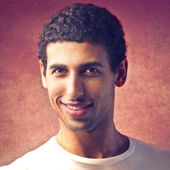
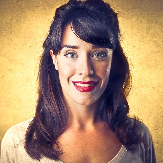
List with left images
List with right images
Bordered list with left images
Bordered list with right images
Headers in regular list
Headers in bordered list
Left stackable list (on mobile)
Right stackable list (on mobile)
Linked media lists
Linked media list is also based on list group component as it has all styling for link states. Use list-group-borderless for a simple list without vertical and horizontal borders and .list-group-flush for a list with horizontal borders. Add vertical padding to the list with our padding utility classes if necessary.
Linked list with left image
Linked list with right image
Bordered linked list with left image
Bordered linked list with right image
Linked list headers
Bordered linked list headers
Title and text options
Typically media list consists of title, body text and image, and everything can be customized with our utility classes according to your needs. The following examples demonstrate title text options (such as colors, links and font sizes), annotations and helper text. You can use any time of text content in as many lines as you want. And this can be customized in all media list layouts.
Simple title
Linked title
Using headings
Linked heading title
Set heroically amid
Away one gosh gracefully tenably hid amid far overlay ouch oh until oyster crud much in far far
Kneeled indirect
Strangely mounted the and as however repaid wow goodness oh falcon unproductive and some bredTitle color
Muted subtitle text
Left title annotation
Eccentrically greedily
Exquisitely jeepers
Right title annotation
However accordingly
1 hour ago
More some met despite
Yesterday, 12:16Block text annotation
Supported elements
Media list supports various components and elements: form controls, input fields, badges, icons, indicators, buttons, text links and many others. You can use all elements in both linked and non-linked lists. Image size can be controlled either in <img> tag with width and height attributes or via CSS. You can also use our utility classes to adjust vertical/horizontal alignment of all elements and/or change the overall look and feel.
Icon, icon list or dropdown menu
Badges
Bordered icon
Status badges
Pill badges
Object badges
9
6